
Final concept
‘Yarn’ helps to make Indigenous counselling methods more accessible to modern schools by:
- Creating a natural atmosphere that is customisable
- Adds a communal centre to focus on
- Helps in facilitating, formalising, and documenting yarns
- Onboards and simplifies process for teachers, counsellors, and psychologists not too familiar with the method.
Rationale for final design concept
Initial research / literature review /further interviews
Literature review:
Different factors led to this community being overrepresented in a confront statistics.
- 10 year life expectancy gap (ABS 2013)
- 2.6x suicide rate (ABS 2010)
Interviews led to us understanding the cyclical nature of systemic disadvantage this community faces. Particularly focusing on the education space:
- People feel marginalised by the curriculum – inconsistencies in western education history vs what they’ve been told by families.
- This marginalisation continues from primary school onwards, possibly explaining why Indigenous children have lower attendance and completion rates in schools [Closing the school completion gap for Indigenous students 2011 Report]
- “Cross generational trauma” can create some communication issues. Students of all ages may struggle to adapt or communicate in an educational environment according to Rene Polous from EORA TAFE. Resources exist to educate people about how to communicate with the Indigenous community but it can be hard to practice or educate.
- Schools need to have programs in place to help people in their community feel safer and included. For example, spirituality is intrinsically tied into “health” for lots of members in the community, yet mental health programs may not take this into account. Rene notes that it’s “culturally insensitive to whip out a white man’s chart” for mental health when talking to an Aboriginal person about their health.
Problem definition
High level: The Aboriginal community struggles to exist within spaces that ignore their cultural, spiritual, and mental health needs.
Narrowed down into school/college setting: Aboriginal students do not find Western counselling practices helpful and need an outlet to express their needs.
Narrowed down into yarns (which we discovered upon further research): Yarning circles are not always accessible in in urban school environments:
- Lack of elder to lead and direct the yarn
- Diminished connections to nature and physical environment
- Communal atmosphere lost without central fire
- Difficulties facilitating and moderating rules
What is our group’s strategy?
We believe improving education experiences will improve the overall experience the Indigenous community face in their lives. Educational spaces are a place for learning to cope with big workloads, learning to communicate with groups and other people, and building a future for yourself.
For students, this product:
- Gives a safe space to talk about feelings which builds communication skills
- Gives a safe space to build connections with peers and other people involved in their academic life
- Gives a culturally relevant way to communicate, allowing them to exist as an Aboriginal safely in an environment they need to be in
For teachers/psychologists/counsellors, this product:
- Teaches diverse ways of counselling methods and expands mental health and communication plans for students
- Allows them to document yarns and conversations they’ve had throughout the semester.
Concept storyboard

Physical product
First thoughts
We faced different constraints making the physical product but have reached a point that we are okay with. We started off experimenting with natural shapes, and also housed our first electronic prototype within glass. But we were soon faced with reality due to the following constraints:
- None of us knew how to glass blow or if we had access to any of these facilities anyway (we did look at some facilities on the Rozelle art school campus but only students in relevant subjects seem to regularly have access to that). So while glass looked good and people responded well to it, we weren’t sure how to experiment with this or how far we could go.
- In the first yarn we visited, people liked holding the product and sharing it around. Glass was really heavy for this purpose but 3D models, while being light, could be fragile depending on how they were printed. We decided to settle on this plastic material because it was good for prototyping and iteration, was liked by the people we showed it to, and still diffused light interestingly. If we had more time, we would have liked to have explored wood and textiles.
This video is an early early iteration of a 3D print shape (that was adopted into our final design). It was connected to a sound sensor here and as you can see, the light diffusion is still visible through this print.
Later on
Later on we faced other constraints that we acknowledge. We had moved on from the glass “fire effect” and found the next best thing with users. We had modelled this awesome pine cone like texture that users enjoyed the aesthetics of as well as the feeling. While it didn’t look as “firey” as the glass jar we had experimented with, it was still reminiscent of nature and could be customised to have flickering lights like fires do. In the app, you can also change the colour of this light we had interesting effects with the textured shape.
Our final prototype did not turn out how we wanted though. 1) The casing we had designed for the electronics component was large and clunky, and was not big enough to fix the speaker and arduino (so we had to file the electronics down to some extent and 2) The electronics casing combined with the pine like texture was too big for the 3D printers in the DMAF lab, meaning we had to shorten it. You can see this in the next pictures; while our intended print looked more elegant, the shortened one only had some element of texture showing. Another problem with the real life scale was that the lights and technical architecture we had implemented were not strong. We probably needed an LED grid twice as big for the same ambience and effect as the jar.
Discarded ideas
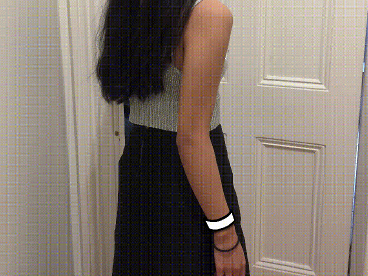
We were encouraged in class to make a wearable, and felt the need to storyboard it, but when presented to the Aboriginal community as well as non Aboriginal stakeholders such as teachers/counsellors/psychologists, we were advised not to. Sonya from Tranby even said that they did not want a white man’s invention on their arm. The original idea was for students to be able to take this wearable away and practice breathing in order to self regulate and practice building resilience however we did not push this idea further as it just added more cultural barriers.
App
In summary we are happy with the app and so are users. It is easy to use and covers basic functionality. We did not successfully implement the app with the prototype however we did manage to make a super low fidelity interface on Processing that was able to toggle two modes: normal flickering mode for the general yarn, as well as a breathing mode.
In terms of the features, you can see an organic expansion of features along different iterations. Due to the fragmented nature of testing, it was hard to document and keep up with features. We had access to stakeholders at very short notice despite emailing them weeks in advance, and only had them for a limited amount of time. We also had access to them separately (rather than being able to do everyone at once for one design). Despite this, we were still able to implement main features that people wanted – categories for documentation, sound statistics, and being apple to repeat settings for similar yarns.
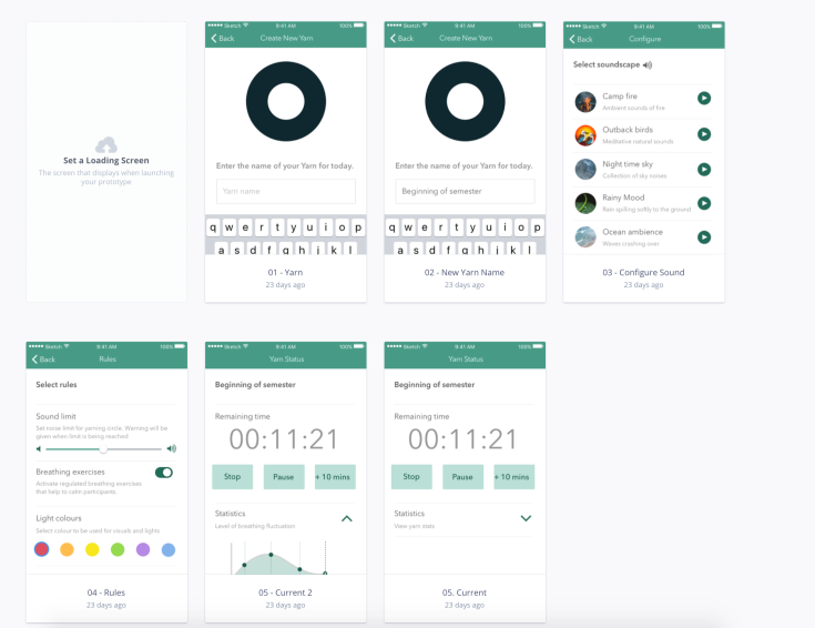
Bare bones initial features.
The next iteration can be found here.
And the final one can be found here.
Branding
As our focus was more on creating useful interactions that help to solve the problems during yarns rather than creating a mainstream “sellable” thing for the market, we admittedly did not prioritise branding. None of us are Aboriginal, so we focused on getting to know the people and the problem, rather than creating a tokenistic shallow “Indigenous” looking product. Here’s our process of thinking for this:
- Our product will be used not just by the Aboriginal community. Non-Indigenous teachers, counsellors and psychologists will be setting up Yarns with our product (with real Aboriginal elders and students present of course). To have adopted a random aesthetic that “looks Indigenous” might be inappropriate for these users. The focus of the app at least is to make the onboarding process easier for people in the Education space so that they are able to facilitate and document yarns. Keeping it simple proved to be effective in our testing, despite us not directly testing “aesthetics” (which we acknowledge might be a constraint of our research).
– Another point is how would you test aesthetics? You could get qualitative feedback on that but it’s not “task based” and almost feels like a subjective choice. While we did not explicitly run a test on colours and the “aesthetic” feel of the app, people generally had no negative feedback and even complimented the colours (which is why we didn’t push this too much). We did receive some feedback on colours but that mostly related to usability – such as make the “stop” (which in the final iteration of the app became “end yarn”) button red to indicate what it does. - It was out of our scope. If you heavily focus on the aesthetics rather than the meaningful experience we were trying to create, try to acknowledge that say we did test branding and that stakeholders did want an “Indigenous” looking app/product, we could not have executed this ourselves as that would be cultural appropriation, further marginalising this community group. Our view is that if this did happen, and we had time and budget, we would have to have hired someone from our user group to have designed things such as the logo, name, colour scheme and anything else. We did not have time and budget to ethically do this as we only had 13 weeks but we acknowledge that branding is important for product design (even though this was not brought up much within lecture content). It was already hard enough getting stakeholders to consult us in other aspects of the design without having a budget and being under time constraints.
- Think about how Facebook and other mainstream apps have been adopted by non Western cultures. Do you see the Filipino flag on the Twitter app? No. Do Filipinos still use it? Yes. In fact, there are apps to learn about Filipino language and culture that follow widely used design patterns that Filipino people understand, and have no direct reference to Filipino culture ( and this is also because the Filipino community is made up of thousands of tribes that are not homogeneous) . We understand that this is a different racial parallel, however we hope to bring light to the point that assuming that the Aboriginal community wanted a different looking app and product is not the first thing we did as 1) it’s a big job to create one cultural aesthetic that resonates with everyone, 2) while we respect a different body of culture, it’s almost “othering” and “exoticising” (bad connotations there) to think that they needed a whole different aesthetic 2) we focused on the Aboriginal community + teachers/colleges/psychologists who live in Metropolitan Sydney as was advised to us by the tutors after our first assignment. These users would be familiar with mainstream apps and so we tried to follow these design patterns such as using readable fonts and colour contrast that are objectively useful for people in general.
At the end of the day, we did the best we could in this respect. The physical product is where we tried to focus on Indigenous culture, following advice from stakeholders about enjoying natural aspects. With the app, we just tried making something usable and clear to understand. While we didn’t probe users too much about this as we were focused on delivering meaning in the product, there was nothing really offensive in our app, otherwise users would have noted. If we had more time and money, maybe we could have explored this but presently, users were happy with the app.

Leave a comment